Improving a Classic Interface to survive decades
Part II: Gameplay
The plans for porting the game are pretty clear – get the game running as good or better as the Flash client. Without a doubt we exceed the stability and performance of the current client already, which is great since this also allows us to look at improvements in other areas. Today we’ll talk specifically about UI elements beyond just the port.
One of the pillars we will be looking at is feedback you receive when you do certain actions in the game, currently we see a lot of potential for improvement in this area.
When porting player facing features over to the new Unity client, it’s not just a copy/paste job. We take a good look at what can be improved when redoing all the work and sometimes ideas get visualised and thrown into planning. Most of these features you will see are still early in development and the current plan is to implement most of them during the beta phase, some might even get scrapped or remixed into other ideas.

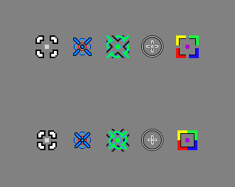
Literally one of the first UI art implementations was the mouse pointer and the idea is simple, every click should get you some feedback. Be it dragging and dropping items in the inventory or holding down the mouse button in intense fights. This is going to be fairly simple to implement so expect this feature to show in the early beta phase. In addition to the mouse click, all interactive elements will have some sort of feedback on hover or on click making the UI feel really tactile.
Enhancing the feel
But we can only do so much in regards to feedback with the UI itself, the more exciting part is to look at what you do most: Dodging bullets and shooting enemies. This feels already pretty good in the flash client, but we wanted to take it a step further.

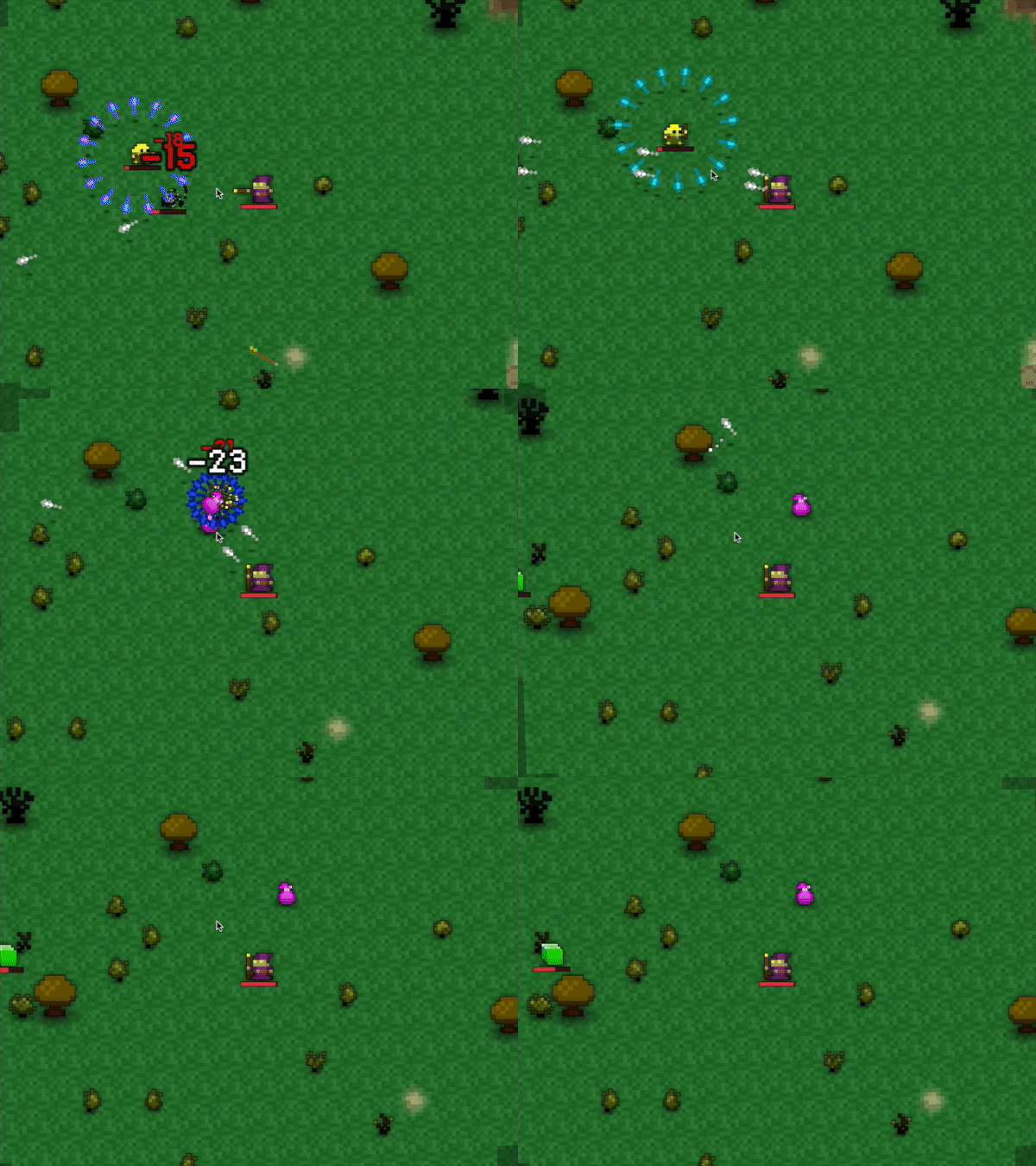
When hitting enemies, in Flash there is currently no feedback besides the floating text above the enemy, in some cases this can get lost when the enemy is on the edge of the display, even though the Unity client allows for a wider viewport. To solve this, we wanted some way of telling the player what is happening, by highlighting the HP bar on hit and updating it shortly after. You will be able to quickly tell if you have done any damage and how much relative to the remaining hit points.

One big part of the game is to interpret floating damage/healing numbers and condition effects. We wanted to make sure you understand what is happening more precisely at a glance. Each damage effect will move downward while positive effects will animate up. Condition effects have their own individual animation, we are investigating options to have more animations based on unique status effects. We also felt that when levelling up a character the text gets lost so we mimic the rotation from the level up particles you see when reaching the next level. These are some examples of how we are fine tuning the animations constantly and reviewing internal feedback regularly.
Pixel Purgatory

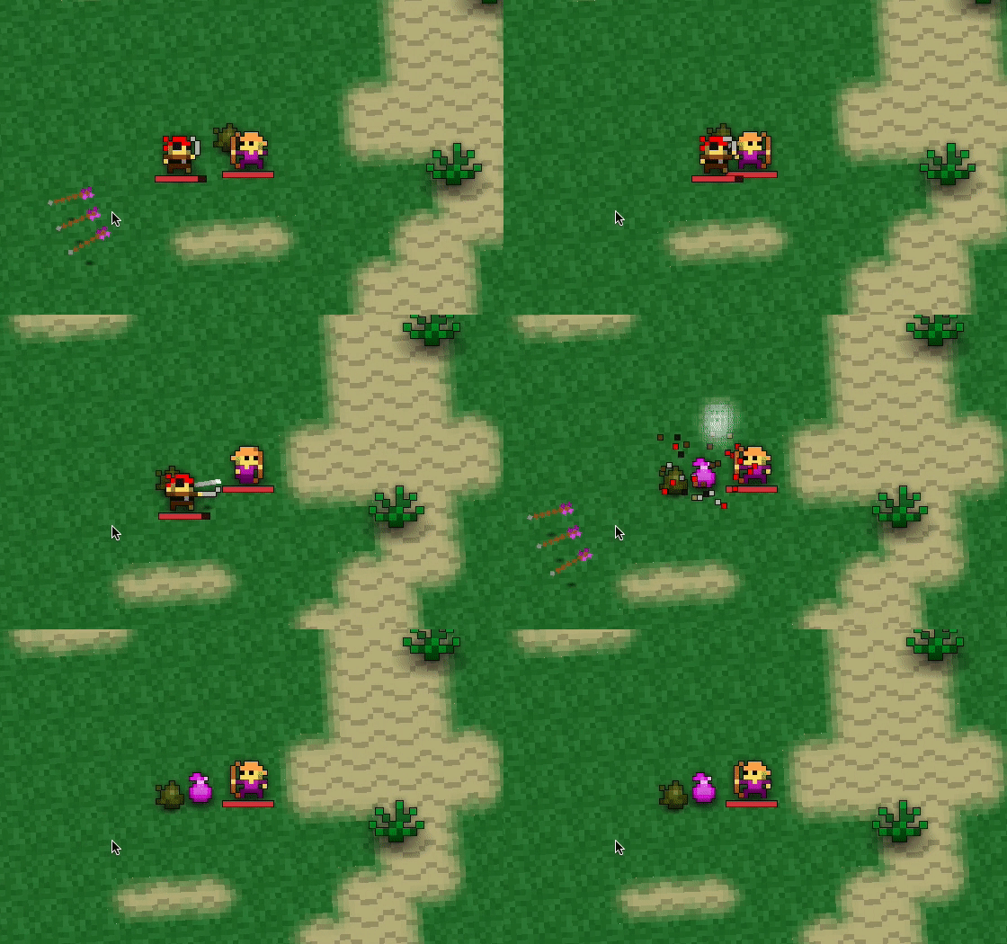
Another area where we have the feeling the game lacks feedback on is when you finish off enemies, currently they just… disappear. We feel this is very lacklustre and are exploring death animations, above you can see one of our early concept iterations. Technically we are looking for a universal solution so that the animation fits even bigger foes, this one is still very early so feel free to voice your ideas on this as well!
Shine like a white bag

Sometimes in the heat of the battle information gets lost, this is especially bad when it happens for loot bags. Like the enemies that just disappear when defeated, loot bags just appear. If you have sound turned on you will get a cue but then again the bag gets lost in the sheer amount of players surrounding it. The idea is straight forward, loot bags will fly up and onto the ground so you can see a glimpse of where they landed. Additionally, we are investigating effects similar to other games where you will be able to see a light beam on bags really sticking out in the crowd so you cannot miss your beautiful shiny white bags.
The dark beyond

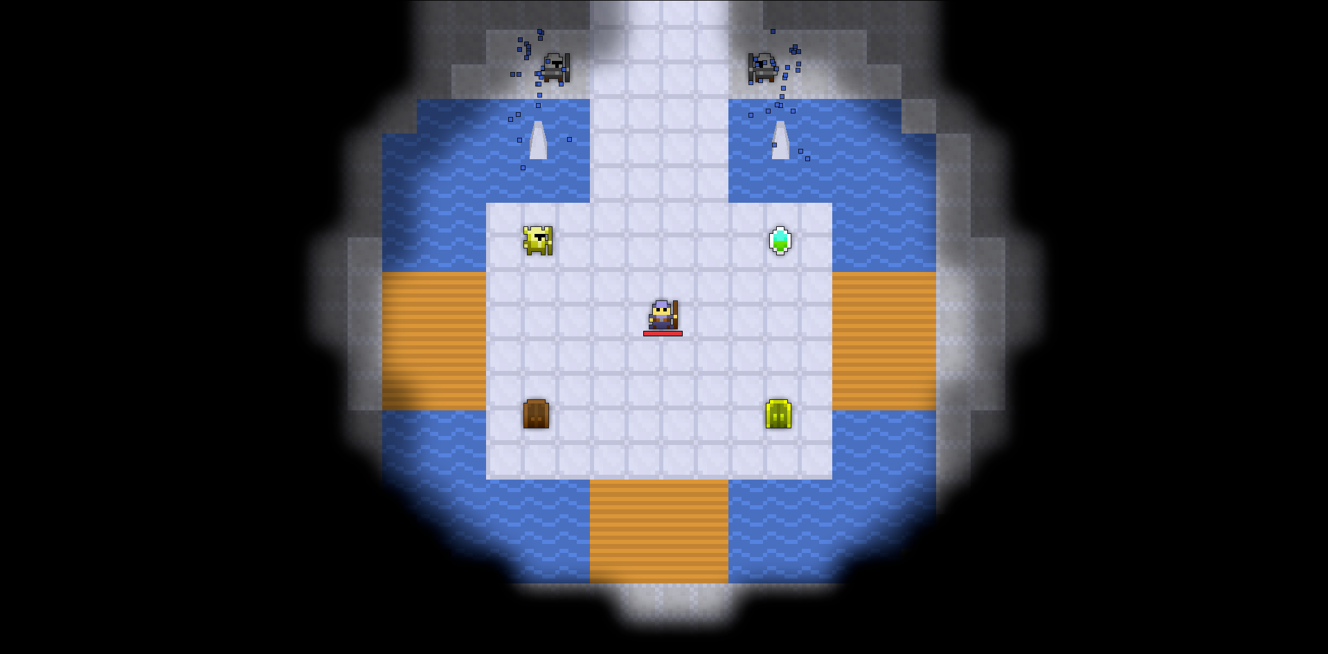
Lastly we wanted to share a short update on the Fog of War, while not 100% related to feedback we felt the need to give you some information on this topic. Initially, when implementing the Fog of War, the idea was simple. Keep the constrained gameplay area but allow for more view when using higher resolutions without giving players too big of an advantage. While we shared our progress a while ago in one of our progress update videos, some concerns were voiced about the abruptness of the current version. I am here to assure you that we have plans to smoothen the transition and blend the tiles to be less of a visual pain. Keep in mind that the picture above is a mockup, once the feature is fully implemented it will look even better.
I hope you enjoyed the look at ideas and concepts. We are working on to further improve the feel of the game. There is still some time before we get around working on most of these but we hope until then we can further fine tune the concepts and include your input on these as well! It’s going to be a fine balance between enhancing the game while not overdoing it.
In Part III we will be closing this chapter of the Behind the Scenes and take a look at the sound and music of the game, the potential to convey important information with sound cues and a glimpse at the music we started to create with external composers.
All the best,
Fidelow


