Improving a Classic Interface to survive decades
Part I: Introduction
This time around we have more to share about our approach to the UI and the possibilities Unity software allows us to use. Beyond just porting the interface, we also look at the way you interact with the game and experience it. There are many variables and UI elements which we can improve. Some of them are going to be ported 1:1 as you know them, but some other parts will get a pass to allow us to grow the UI without constraints from the past. Giving us more flexibility and allowing us to create new features much faster in the future.
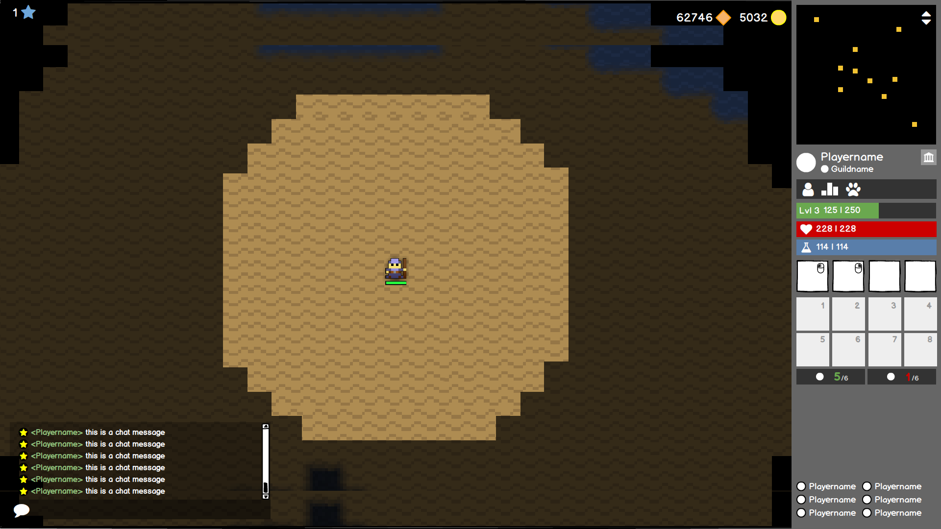
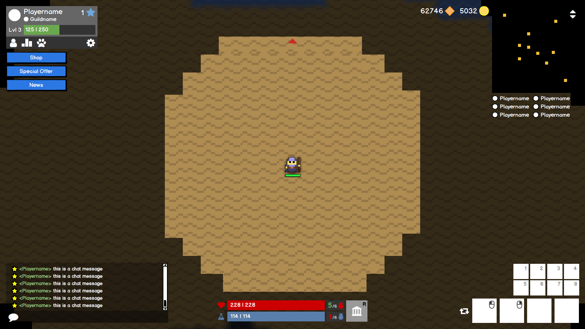
We have seen the demand to keep the legacy User Interface in tact to provide the same experience as in the current Flash client, but we are also going to explore new possibilities. You will be able to choose between a Classic UI and a modern interpretation with a fine tuned experience. While we focused on implementing the interface the way you know it, the work on the modern version has been pushed back to allow for refinement and solid implementation.
One of the best parts of porting a game is not only having the fundamentals being set right, but also giving us the chance to look at the whole experience holistically and from the ground up.
Setting the stage
In Realm of the Mad God Remastered we already have better loading times thanks to better optimizations and a more robust foundation, but we also wanted to reduce the redundancy in loadings screens. Switching Characters will be seamless to execute from the Nexus, when dying you will be able to quickly select your next Character or create a new one. Starting up the game you will be directly logged in with your last played Character.
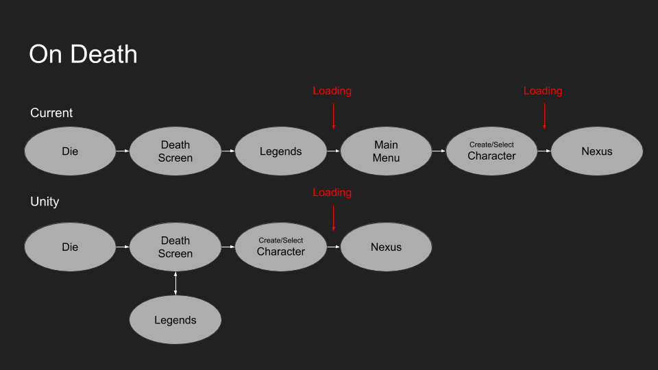
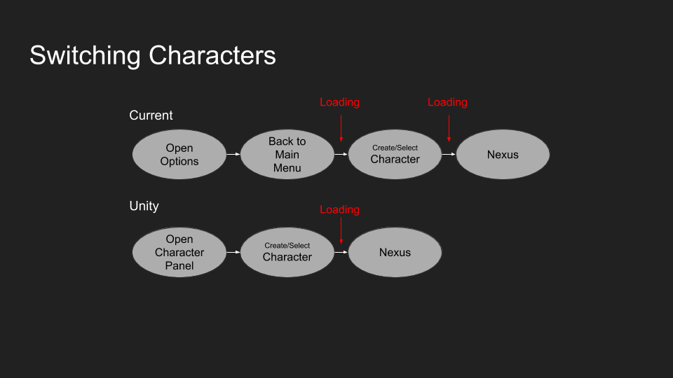
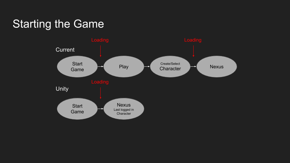
Throughout the game you will find many of these smaller improvements. We reduced steps to get you back into action and generally making the flow feel much more complete. It is a fine balance between removing old and adding new things such as the loading in effect you may have seen in our latest teaser just to further increase the immersion.
A continuous process
We started R&D on the implementation of the interface even before we kicked off the Unity project. Many questions had to be answered before any line of code was written. Scaling issues had to be fixed to make sure the UI looks good on any resolution and new ideas had to be tried out to see what works best. More importantly, what doesn’t.
While major changes are very unlikely at this point, we still keep iterating on the other parts of the interface before the features are fully implemented in the Beta. Looking at what we have in Flash helps us find any issues early since the game is already live and we go through a lot of feedback and suggestions from you guys. Even in the Beta and beyond we may touch up the interface here and there based on your feedback.
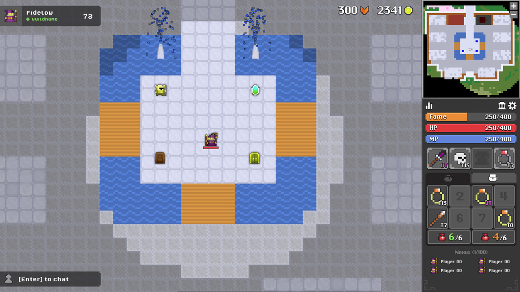
The foundation is now built and one of the upcoming sprints will also look at animations and effects. But that’s an entire topic by itself for the future 🙂
Stay tuned for Part II, where we will be sharing more details beyond the simple General User Interface and talk more about the gameplay experience and interactions itself!
All the best,
Fidelow


